
All news
Improvement
A cleaner, smoother Dialogue Builder
Our last update gave the Dialogue Builder a new canvas. Now we've rebuilt everything around it. The goal was simple: more room for your dialogue, fewer mystery buttons, and always knowing that your work is saved.
This redesign took a while, and we're glad it's finally here.
Before and after
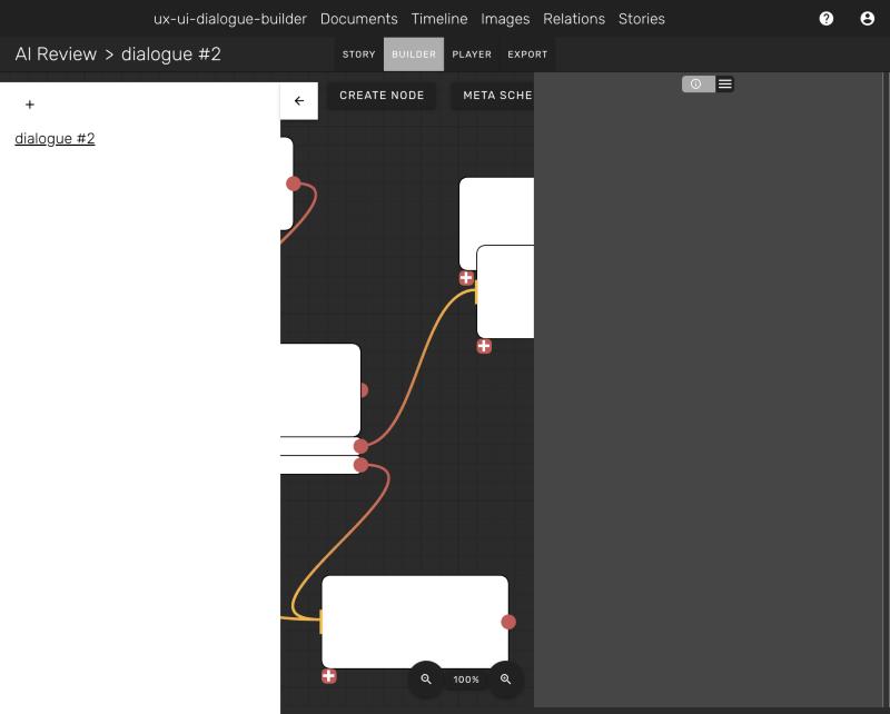
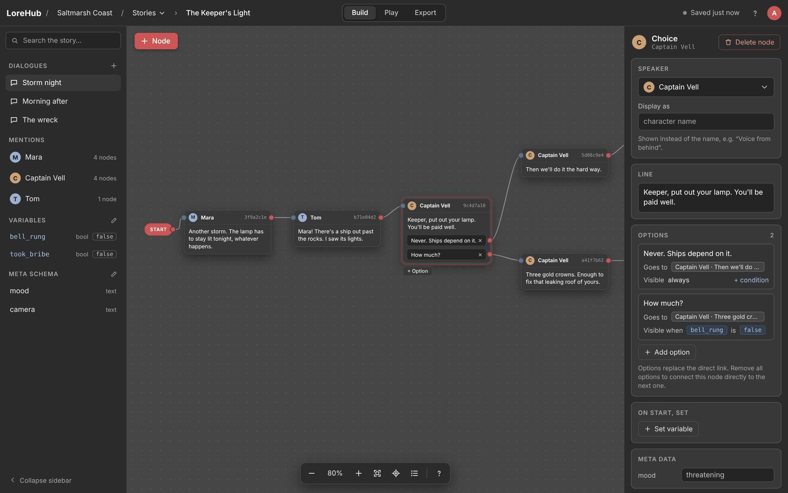
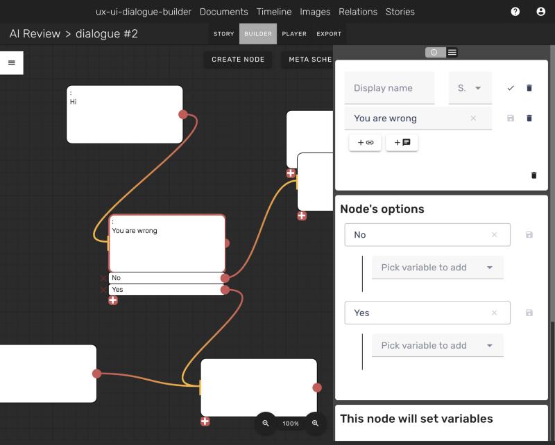
Before, the dialogue list sat on top of the canvas, the mode tabs were greyed out without saying why, and the right side of the screen was an empty grey panel until you picked something.
What's new in the Dialogue Builder
- One top bar. The story name, the Build, Play and Export switcher and the save status now live in a single slim bar. The builder opens straight into Build.
- A docked Explorer. Dialogues, mentioned documents, variables and the meta schema sit in one sidebar on the left, with search. It docks next to the canvas instead of covering it, and you can collapse it.
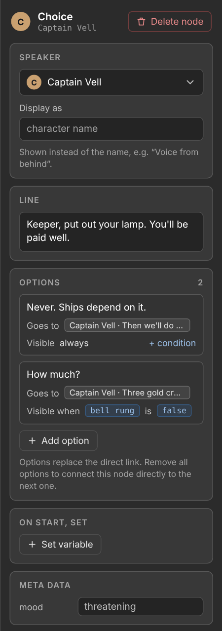
- A clearer inspector. Speaker, line, options, conditions, variables, meta data and connected documents each get their own labelled section. Every button says what it does, and there is one delete for the node instead of three unlabelled trash icons. Deleting asks for confirmation inside the app.
- Canvas tools at the bottom. Zoom in and out, fit the whole dialogue to the screen, jump to the selected node, and open a searchable list of every node. Pick a node from the list and the canvas glides to it.
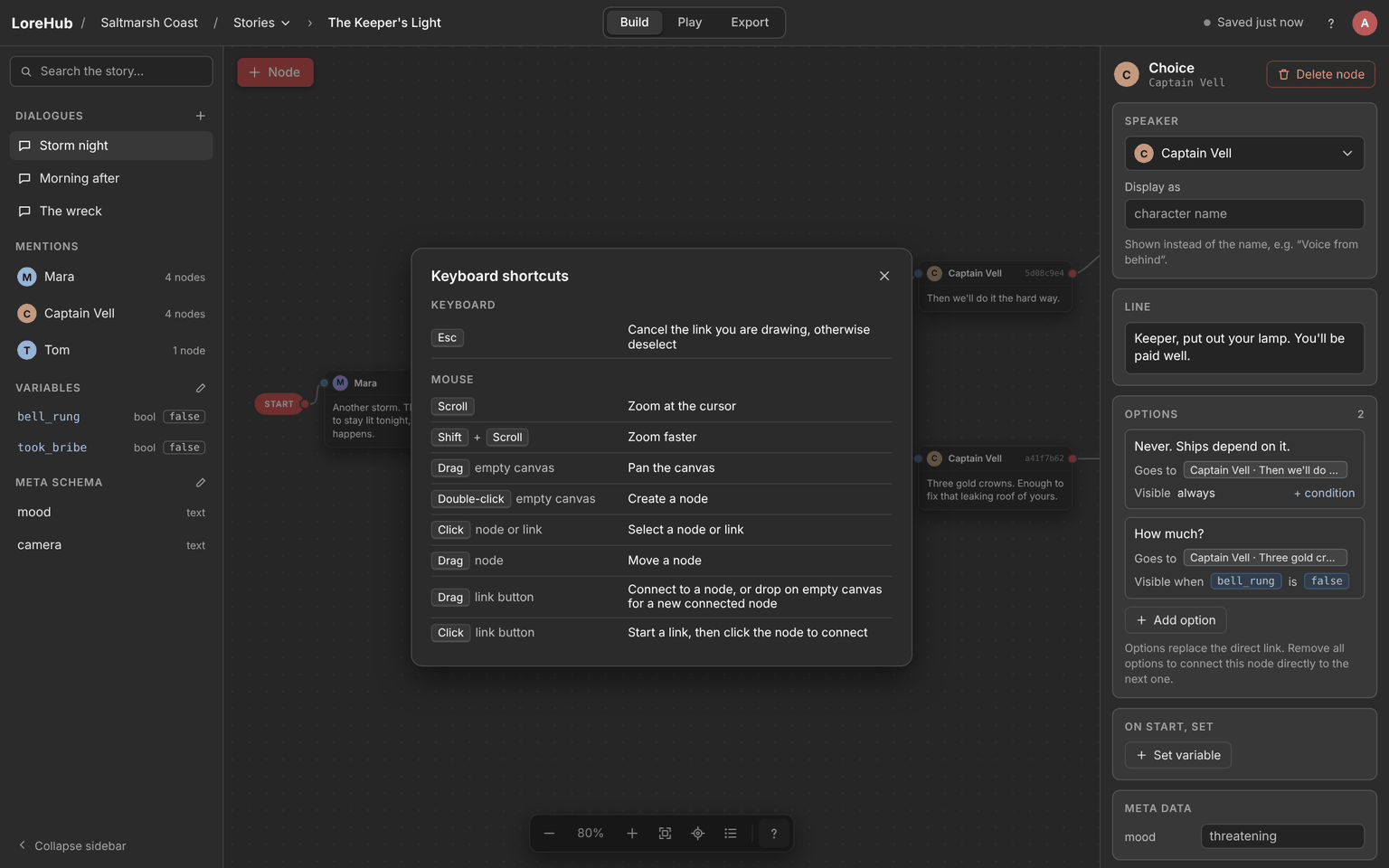
- Shortcuts, explained. The ? button opens a card with every mouse and keyboard shortcut, like double-click to create a node or drag from a link button to connect.
- Autosave you can see. The top bar shows "Saving…" while LoreHub talks to the server and "Saved just now" when it's done, so there are no save buttons to hunt for.
- Nodes you can read at a glance. Each node is a dark card with the speaker's avatar and name in its header and up to four lines of text, cut cleanly with "…". Links come in on the blue dot and leave from the red one, and options sit inside the card with their own red dot.
- Calmer colours. A light grey canvas with a dot grid, grey links, dark grey bars and inspector sections that stand out from the panel, so your dialogue is what you see first.
Try the new Dialogue Builder
Open any dialogue in LoreHub and press ? in the bottom toolbar to see what's possible. If something feels off, tell us on Discord or Reddit.